25 Creative Dark Business Card Designs with Bold Minimal Branding
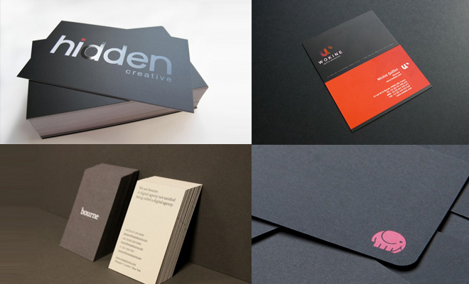
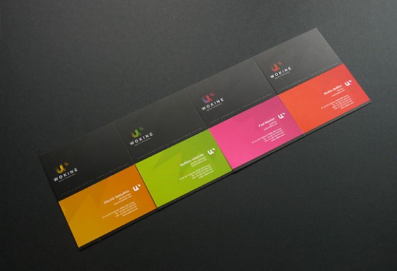
These 25 dark business card designs show how a restrained palette can give a small piece of print a confident, premium presence. Black and charcoal stock provide the foundation, while white type, compact colour accents and carefully placed logos create contrast without crowding the layout. The strongest examples treat negative space as part of the identity rather than unused room. That breathing space helps names, contact details and brand marks stay readable, and it gives tactile finishes or unusual cuts a chance to register. Dark cards also make production choices especially visible: alignment, type weight and ink coverage need discipline because small inconsistencies can stand out against a quiet background. For branding inspiration, the collection is useful as a study in hierarchy as much as colour. A card still has to communicate quickly, fit comfortably in the hand and remain memorable after a brief exchange. Browse all 25 examples to see how typography, contrast and finish shape distinctive dark business card designs.
.jpg "darkcolor businesscard (8)")
.jpg "darkcolor businesscard (6)")
.jpg "darkcolor businesscard (5)")
.jpg "darkcolor businesscard (4)")
.jpg "darkcolor businesscard (3)")
.jpg "darkcolor businesscard (2)")
.jpg "darkcolor businesscard (1)")
.JPG "darkcolor businesscard (21)")
.JPG "darkcolor businesscard (9)")
.jpg "darkcolor businesscard (18)")
.jpg "darkcolor businesscard (16)")
.JPG "darkcolor businesscard (19)")
.jpg "darkcolor businesscard (14)")
.jpg "darkcolor businesscard (17)")
.JPG "darkcolor businesscard (12)")
.jpg "darkcolor businesscard (15)")
.jpg "darkcolor businesscard (10)")